Back to Fort Fairfield Journal WFFJ-TV Contact Us

![]()
![]()
Maine DHHS Changes Graph Display to Conceal Low Death Numbers and Uselessness of Governor’s Face Mask Mandate
By: David Deschesne
Fort Fairfield Journal, January 13, 2021
In order to prop up Governor Mills’ failing narrative of COVID-19 being “deadly and dangerous” the Maine Department of Health and Human Services changed the graph presentation on their COVID-19 reporting web page late in December to camouflage the relatively benign nature of COVID-19 in Maine as well as hide the fact that the governor’s mandatory face mask mandate - which she ordered on December 11, 2020 - has been a complete failure at stopping, or even slowing, the spread of the respiratory virus that is now known to have a greater than 99.9% survival rate among a vast majority of the public.
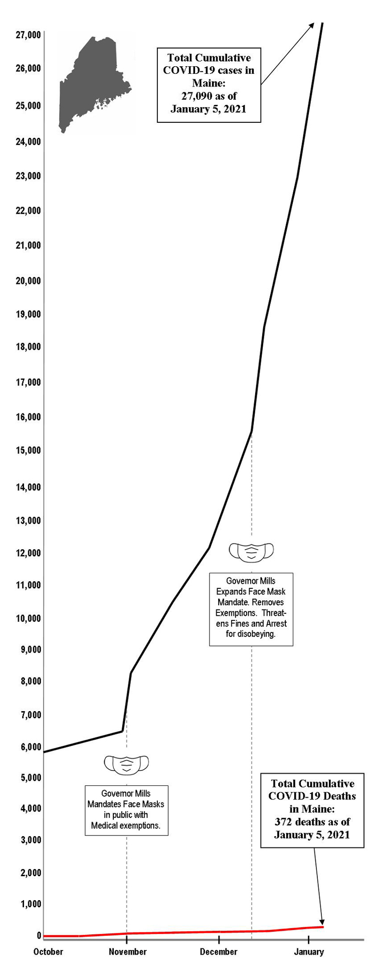
Throughout 2020, the Maine DHHS displayed a cumulative, running total case and death chart on its COVID-19 data page (FIGURE 1). This style of graphic presentation was chosen to create the highest psychological impact with the dominant line being the running total of COVID-19 “positive” cases throughout the year. Since recoveries were recorded as a separate line on the graph, the visual display was geared to show a continually rising case count at first glance - a tactic which was employed to scare the public with hysterical frenzy and give the establishment news media fodder to help prop up the governor’s command and control, central planning response to the virus.
While the fear tactic worked for a while, it began to backfire when the chart showed Maine was not accruing anywhere near the number of deaths predicted at the outset of the pandemic- a number that was continually becoming irrelevant as positive case numbers exploded through the stratosphere while the death numbers trickled too slowly upward and thus stopped selling the panic the governor and media were trying so hard to culture in the public mind. The old chart also showed the abject failure of the mandatory face mask mandate as everyone is now forced to wear face masks and yet the “positive” case numbers continue to skyrocket.
In changing to a daily case count and eliminating the total deaths from the graphic presentation (FIGURE 2), those features of the COVID-19 virus are more easily camouflaged from public view. The numbers are still available, but they need to be researched by scrolling down the page - something most establishment media journalists and many members of the general public have neither the time, nor interest to actually do on their own.
Currently, only five to eight people per day are actually being hospitalized in all of Maine for COVID-19.
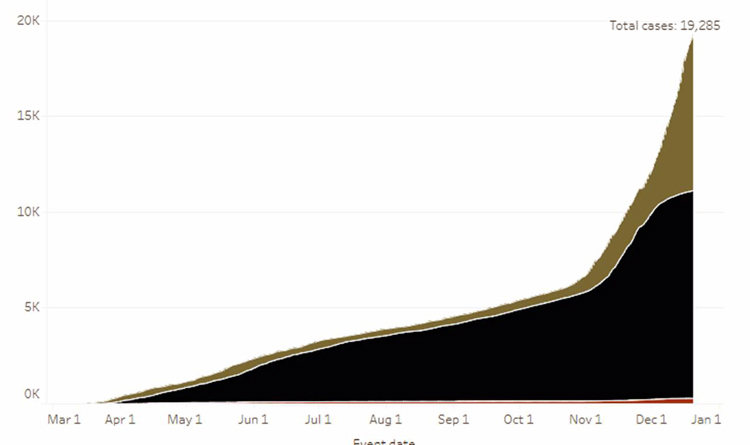
FIGURE 1. The graph most Mainers were used to seeing throughout 2020 at the Maine DHHS website shows a precipitous and alarming rise in COVID-19 “positive” cases by displaying the total number of cases to date. Since Governor Mills’ mandatory, no exceptions face mask mandate went into effect, the graph began illustrating the ineffectiveness of face masks to stop the spread of the virus. It also showed the extremely low death rate from the virus, so the DHHS chose to change to a daily case number display to soften the appearance of the data. If the old chart was still being populated with data, it would look like the graph on the right side of this page.
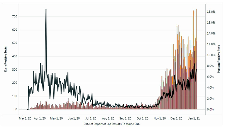
FIGURE 2. In order to soften the visual impact of the data which was vividly illustrating the abject failure of Big Sister Mills’ mandatory - no exceptions - face mask mandate, the Maine DHHS switched to a daily case numbers reporting presentation, rather than a cumulative case chart as shown in Figure 1. This new chart also removes the death numbers, which are unimpressively small when viewed in relation to the overall case numbers - thus illustrating how few people are actually dying from COVID-19 in Maine.